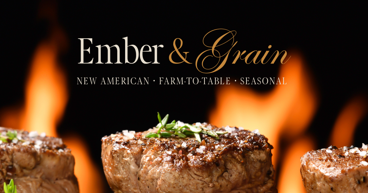
Brand identity for a New American, farm-to-table restaurant — seasonal, warm, refined.
The thinking
A farm-to-table concept lives or dies on a feeling — that what's on the plate was chosen with care, this season, by people who give a damn. The brand's job is to make that feeling legible before the first bite: a warm, seasonal identity that makes a changing menu feel like a story rather than a list.
How it's built
A complete identity — wordmark, palette, and an editorial site system on the Crystal design tokens — so the same brand language carries from the logo to the menu page. Photography-led, menu-forward art direction keeps the food the hero.
Craft
- Logo, wordmark, and a warm seasonal palette
- Editorial brand system on Crystal tokens
- Photography-led, menu-forward art direction
Stack
Next.js · Crystal Design System · brand identity
Role: Brand + design · Artasce Creative